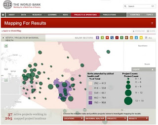
 The World Bank continues to explore ways to promote development through use of its extensive data collection. Mapping For Results is focused on visualising the location of various development projects, as a means of exploring the relationships and results.
Visualising data is an increasingly popular way to get your head around sometimes complex issues. The trick is to keep it meaningful and obvious, while competing for attention against many other visual distractions.
The World Bank explains this initiative on its website:
"The main objectives of the program are (i) to support the monitoring and reporting of results by providing users with an analytical tool to analyze and visualize the geographic location of Bank-funded projects at the sub-national level ; (ii) to improve aid effectiveness by enhanced transparency and accountability of donor-funded operations and (iii) to strengthen the participation of multiple stakeholders, including civil society organizations and citizen groups in the Bank’s work at the country level."
